NOTE: The code below is not mine, it is simply copied from the sources below. As I have stated, I am simply repurposing them using the COVID data in order to attempt to get an output similar to what the Titanic model did.
PREDICTING COVID SURVIVAL:
Objectives:
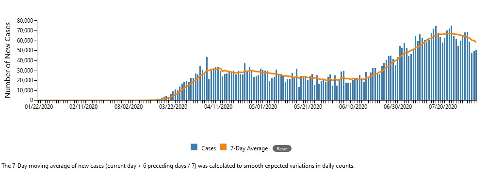
Right now, the coronavirus pandemic is raging in the United States. It has almost been 5 months since the WHO declared the coronavirus a pandemic. Looking at this graph by the CDC1 that shows daily coronavirus counts, it seems that the pandemic is not even close to ending:

The promising thing is that right now we seem to be trending downwards like we did in April. However, it could be possible that we spike right back up again just like we did in June. In order to hopefully help combat this virus, I attempted to create a model that takes in multiple features and assigns a percentage value that it contributes to recovery. </br>
Problem Statement:
Unless you have been living under a rock or believe in conspiracy theories, it has been almost 5 months since the coronavirus was declared a pandemic by the WHO. The impacts on our daily lives have been…unexpected. As such, I hope to apply what I have learned this summer in both DATA 146 and 310 to create a model that will take certain features and output its contribution towards survival. I hope that this model can be analyzed and increase everyone’s ability to survive should they catch the coronavirus since they will know which features are more important and prioritize them.
I will be repurposing the Titanic model where we analyzed whether an individual would die based on many features. I will gather wholistic data on the current coronavirus pandemic and apply it to a boosted tree and linear estimator model and compare their accuracies. The largest part will be preprocessing the data so that it can be read by the model. Another potential problem will be understanding the output through graphs. As of August 3rd, there are 4,694,126 people that tested positive and 147,653 people who have died to coronavirus or coronavirus-related complications. This virus has touched everyone, whether its a immediate or close family member, a friend, or a mentor.
The Titanic model takes in multiple features and determines which features are important to an individual’s survival as a percentage. This model takes in data and encodes it inside feature columns which are then used to create input functions for the model. The input functions are then inputted into both a boosted tree and linear estimator model where their accuracies will be compared. I then plan to create a violin plot in order to assess the model’s results. The violin plot will allow me to see which features had a large or small effect on coronavirus survival on a broad scale.
I do not anticipate this to be a very complicated process, I am simply using some already written code and repurposing it with new data (at least I hope). The reason I believe that preprocessing the data will be a large problem is because each dataset is unique. Not only that, but every model is very specific in its inputs. I have to understand what the model wants and figure out a way to preprocess my data to match the model input specifications.
Data & Features:
I used continuous data from The COVID Tracking Project. The COVID Tracking Project partners with Boston University Center for Antiracist Research. It is a source of data for Johns Hopkins and The White House. This dataset starts on January 22 and is ongoing as the coronavirus continues to spread. There are 25 features, some of which are useful and some which are not as useful. A complete list of the features are: date, states, positive cases, negative cases, pending cases, hospitalized currently, hospitalized cumulative, in ICU currently, in ICU cumulative, on ventilator currently, on ventilator cumulative, recovered persons, date checked, deaths, hospitalized, last modified, total infected, total positive and negative cases, death increase per day, hospitalization increase per day, negative cases increase, positive cases increase, total test result increase, and hash. As of August 3, the dataset contains 196 points, one for each day starting at January 22. I decided to only use the positive cases, in hospital, in ICU and on ventilator as my features.
Neural Network:
I used two classifiers: the boosted tree and linear classifier. The boosted tree classifier takes trees and combines its learning ability with other tress, essentially making an additive model. Very simplified, the classifier takes multiple trees and splits it and assigns each split a number. Then the splits are added up and used to make a prediction2. Overall, the linear classifier attempts to classify the data in to two distinct datasets using different approaches3.


From Source 1
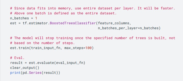
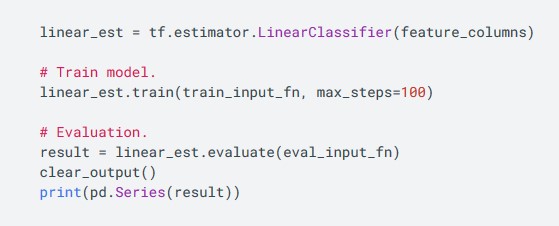
I used the same specifications as the Titanic dataset since it was so similar to what I was applying the coronavirus data on. For the boosted trees classifier, since my dataset is small, only 196 points, I can just give my model the entire batch. I also just set the max_steps, which are like the epochs, to 100 since it is a good number when training the model normally. For the linear classifier, I just gave it my data since nothing really needed tuning. I trained it for 100 steps.
Results:
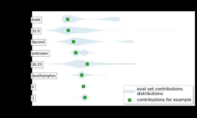
Unfortunately, I was not able to get results. As predicted, I was not able to preprocess the data so that it could be accepted to the data. For the error, I got a invalid argument error due to by labels not being labeled correctly. As such, I will share some results from my source and explain what I was hoping to get from my models. Similarly, I wanted to create a violin graph similar to the one pictured here:

From Source 2
You can see that it has some features on the y axis and the contribution to predicted probability. In this project, I wanted to see what features contributed to survival and which ones contributed to death. A negative probability predicted probability for death and a positive probability predicted greater probability for survival. Specifically, I was interested in seeing if going to the hospital actually increased or decreased your rate for survival. Since going to the hospital increases your chance of getting infected while there, it is possible. Not only that, but I was wondering if getting hooked on a ventilator actually increased your rate of survival.
Conclusion:
Unfortunately, I am unable to make any conclusions since I was not able to get any results. However, I believe that if I had more time, I would be able to fix this problem and actually get output that I could compare to the violin plot referenced above. Also, with more time I could also add some additional information to narrow down the scope of this project. Instead of looking at the United States and the factors that influence survival in a general sense, I could narrow it down to the individual level. Finding a dataset would be hard since it is confidential, but I believe that this would be more impactful then a general study since it will find correlations that directly effect an individual’s survival rate instead of the general public. This then can be applied and used to prepare at risk individuals in advance.
References:
- “Cases in the U.S.” Centers for Disease Control and Prevention, Centers for Disease Control and Prevention, www.cdc.gov/coronavirus/2019-ncov/cases-updates/cases-in-us.html.
- “Introduction to Boosted Trees.” Introduction to Boosted Trees - Xgboost 1.2.0-SNAPSHOT Documentation, xgboost.readthedocs.io/en/latest/tutorials/model.html.
- Abedi, Parisa. “Linear Classification.” Compneurosci, compneurosci.com/wiki/images/c/c0/Linear_Classification.pdf.
Sources:
- “Boosted Trees Using Estimators: TensorFlow Core.” TensorFlow, www.tensorflow.org/tutorials/estimator/boosted_trees.
- “Gradient Boosted Trees: Model Understanding: TensorFlow Core.” TensorFlow, www.tensorflow.org/tutorials/estimator/boosted_trees_model_understanding.
- “Data API.” The COVID Tracking Project, The Atlantic, covidtracking.com/data/api.